Tl;dr we have a dark theme now.
For you who enjoy reading, worry not.
As the Cambridge Dictionary defines it, neon stands for a chemical element that is a gas with no smell or color, does not react with other chemicals, and shines red when an electric current goes through it.
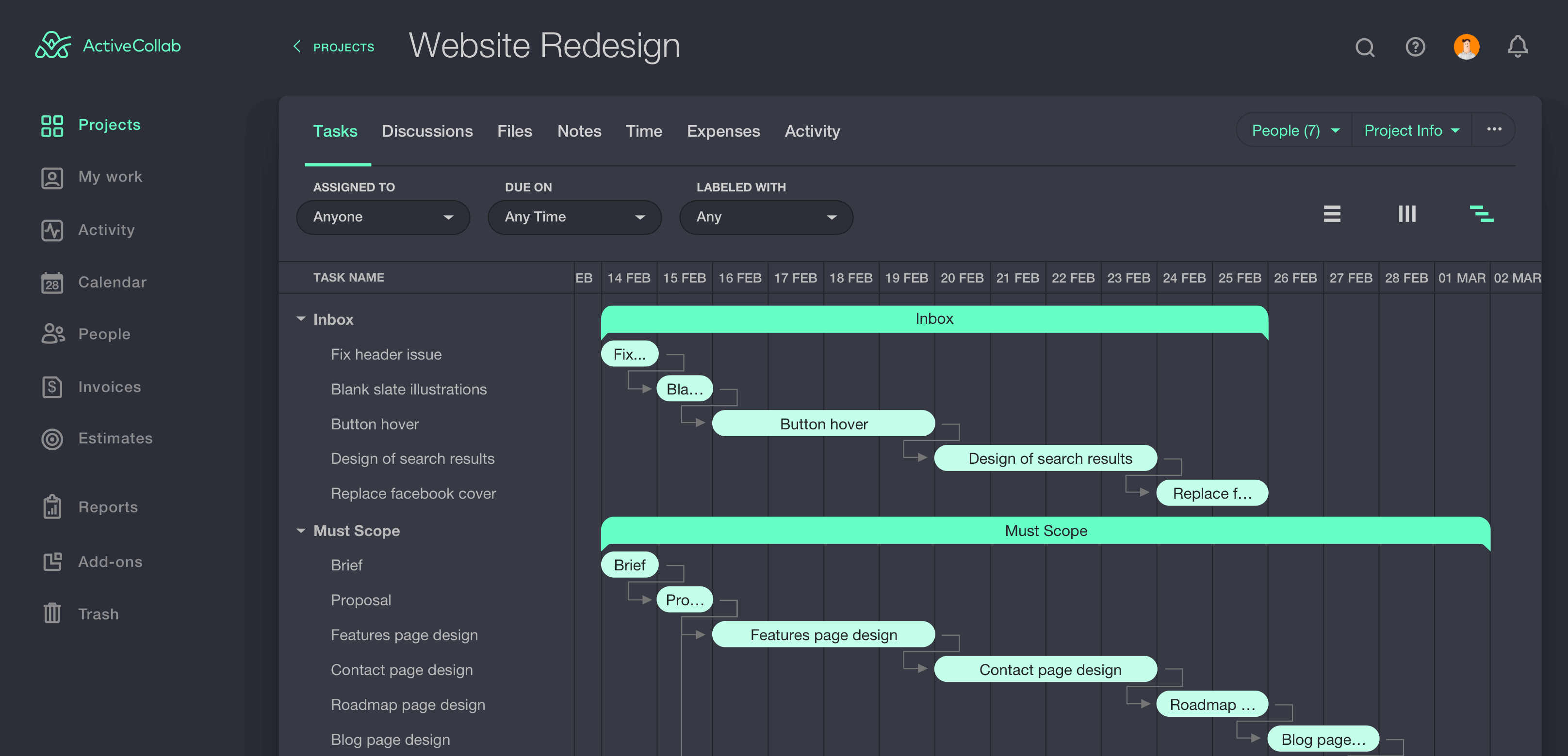
Here at ActiveCollab, we define Neon as the new ActiveCollab theme. Dark in color, awesome in character.
A Sight For Sore Eyes

However, when it comes to overall productivity, our eyes prefer dark themes. It applies to the situations when eyes are performing subtle glances at the content, not reading every pixel. And, software can also benefit from a dark-colored interface - it brings them out more than a white-colored one would.
Night Bird, the Scientist
We tend to see things bluish in low-light conditions or in complete dark. It’s the so-called Purkinje effect and we were well aware of it while choosing the colors for the Neon theme. The goal was to implement colors that are suitable for working in such conditions and… voila!
What I’m really proud of is our set of icons. It was an amazing challenge to design them so they work well both on dark and light themes, but also live and breathe within our new look & feel. This way we ended up with only one set of icons and we saved time on coding since the icons don’t have to dynamically change depending on the chosen theme!
For some, it’s a high-quality chair that keeps them going. For others, it’s a dark theme, and we’re not here to judge. We just don’t like that staring-directly-into-the-sun feeling during nighttime.
Turn the Lights off