
Managing and working on a project is a dynamic experience. It's not always a smooth sail, and experienced teams and managers expect and face bumps almost daily, sometimes employing techniques like crashing to make up for lost time.
Burnup and burndown charts help you visualize progress data, visualize progress, make better forecasts for future projects, and keep the project on the right track.
They make project management much easier to plan and execute, which is exactly why we want to show the real differences between them.

The definition of burndown chart and burnup chart
Before we dig into differences, similarities and use cases, it's important to understand what are burnup and burndown charts all about.
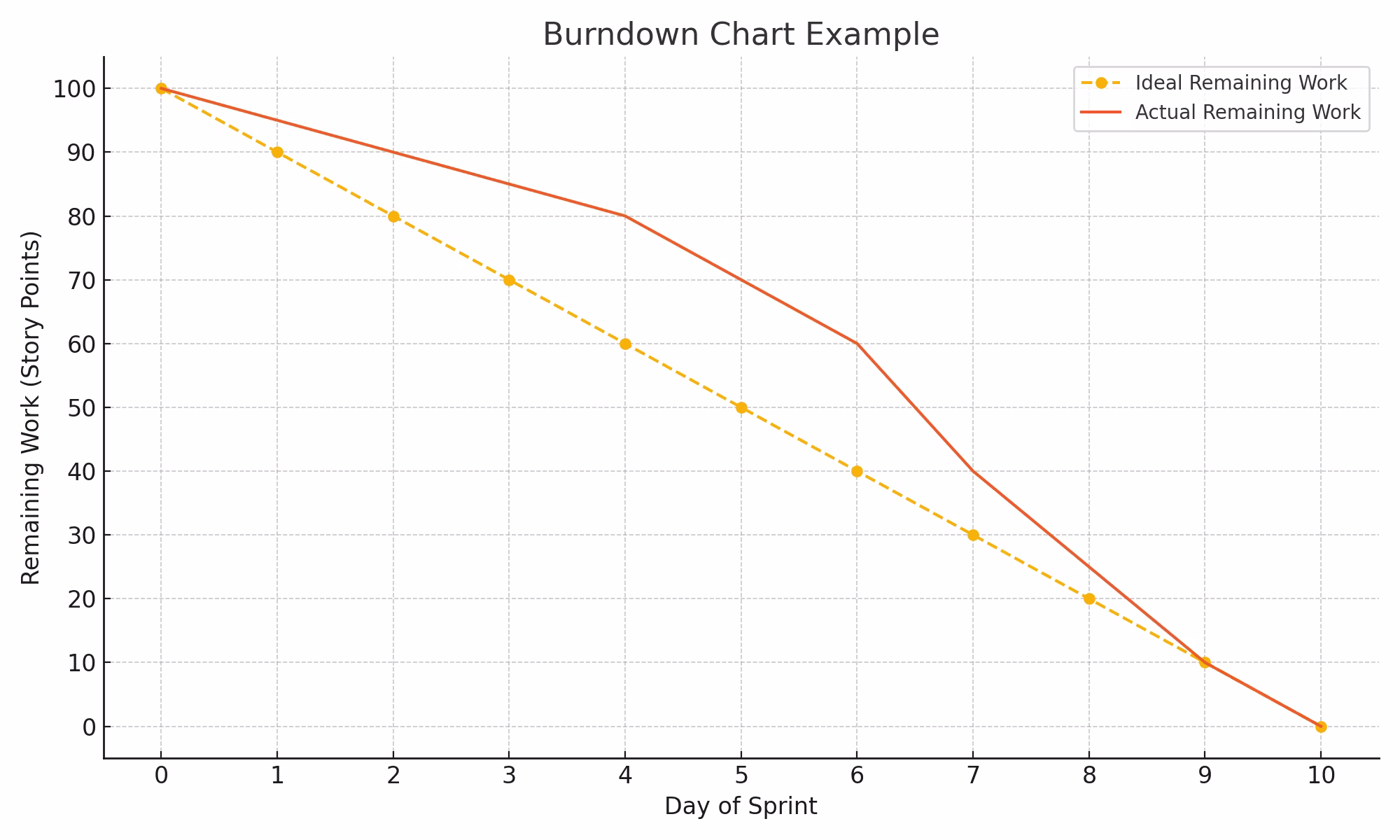
Burn down chart:
- Used to visualize work and progress
- Simple to understand and use
- The total amount of work diminishes
- Removes work done from a pile
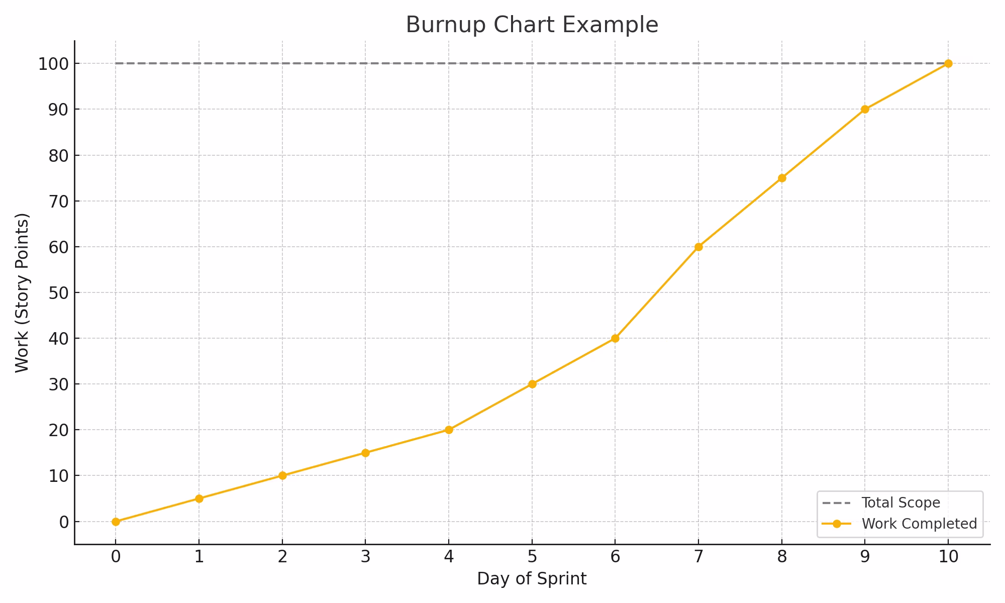
Burn up chart:
- Used to visualize work and progress
- Simple to understand and use
- Starts from the lowest point
- Adds completed work to a growing pile
Burnup vs. burndown charts: Key differences
Even though from the very first few lines the differences and similarities are obvious, let's dig into more details – into the differences for the start...
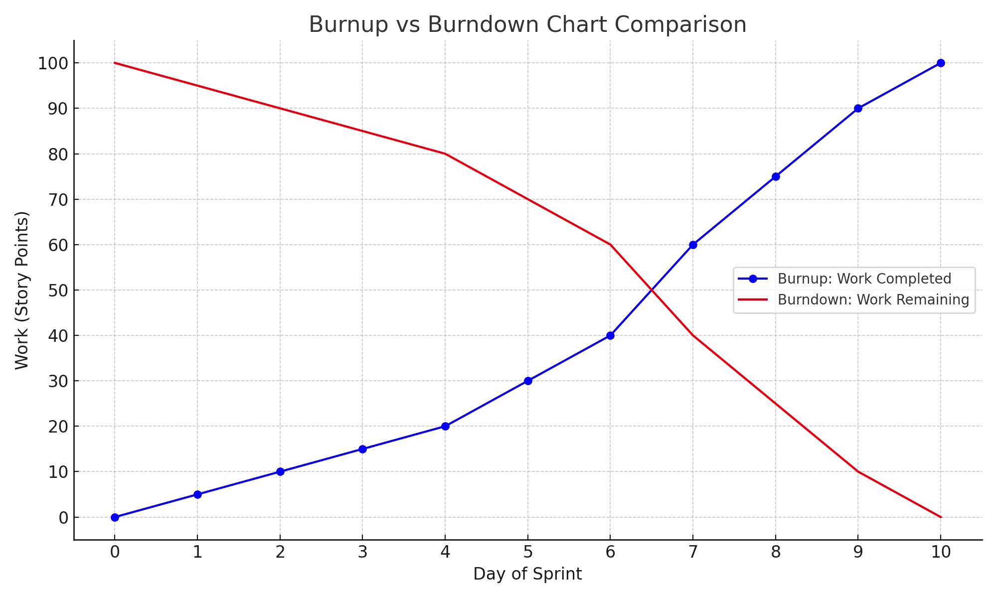
Axes and lines
Burnup and burndown charts have two axes.
The horizontal X-axis represents units of time, and the vertical Y-axis represents units of work and effort invested in the project. The horizontal axis can show days, weeks, months, or sprints. The vertical axis can show tasks, items, or user story points.
The burnup and burndown charts have two lines.
The ideal line connects the start and end points in a straight line, showing ideally how the project should progress. The trend line shows the actual progress made on the project. Burn charts can display progress or stagnation or indicate the team must catch up on schedule.
Data insights
The data insights shown in the burn up chart and burn down chart are valuable for everyone involved in the project. Burn charts provide valuable information on the project's progress, the team's velocity, and the scope creep.
The progress made on the project is compared to the estimation or the ideal line the team tries to achieve. This allows project managers and teams to introduce changes if the project is not going as planned or prepare for their next project if charts show they will finish ahead of the scheduled date.
Velocity in project management shows how much work a team has completed over a period of time. When planning a new project, the project managers consider the team's velocity in previous projects to be able to use that to predict how long the team will need to finish the next project. Burn charts show the team's velocity and keep track of it over time.
Scope creep can affect the team's productivity and prevent them from finishing the project in time. Burn charts can be used to show and limit scope creep. When the project's demands expand during the project, it's helpful to see how much work has been added over time and communicate the real progress to stakeholders.
The data insights project managers will not see in a burnup or burndown chart are all the pending tasks still in progress. The burn charts focus on what's been done so far, showing the results achieved.
Decision-making
When managing a project, it is important to make informed decisions based on the available data and information to move the project in the right direction. Both burndown and burnup charts can help decision-making by providing sufficient information on scope creep and progress.
Burn charts show the likelihood of completing the project or sprint by the project's due date and how much time is left. Having all the necessary data in one chart allows better planning and decision-making, leading the projects and the team toward success.
Burndown and burnup charts are excellent ways to record progress data and use it to make future decisions. Data-driven decision-making helps to rationalize and inform decisions based on the collected data. Backing up your decisions with data will help you make better decisions that will lead your team and project toward success.
Flexibility in scope
For the project to be finished, the team needs to complete the project's scope. If the project has fixed scope, that might affect the performance and completion time, which is where burn charts can come in.
Burn charts allow teams to oversee changes in the scope. The project scope can be represented by the number of story points that must be delivered during a certain period.
Project managers usually use the team's velocity as a reference to determine the scope of a sprint or an entire project, setting the team for success. The items being added to the project as project requirements are increased over time can delay the project's completion. Compared to fixed scope, being flexible with it allows teams to plan for the unplanned and be prepared for every scenario.
Best use cases
The first step to using a burn chart is estimating the project and the team's velocity. Let's say an entire project is estimated to have 50 story points. The team's velocity is 10 story points per sprint. This means your team will need anywhere between 4 to 6 sprints to complete the project, and if they keep up at their current pace, they will complete the project in 5 sprints.
The number of sprints is placed on the horizontal axis to create a burn chart. The vertical axis shows the number of work units, such as story points. The results are marked in the chart, creating the trend line as the project or sprint work occurs.
Similarities between burnup and burndown charts
Burnup and burndown charts are very similar and seemingly can be used interchangeably. However, there are a few differences in how they are used.
Visual Tools
Visually, burndown and burnup charts are very similar. They display the same data and information, but they do so from a different perspective. Burndown charts are easy for project members and clients to understand, as they show work diminishing over time. However, a burndown chart cannot accurately represent new work added to the scope and shows it as a stagnation of work rather than an increase of scope. On the other hand, scope creep is clearly shown in the burnup chart, indicating that the amount of work increased at a time.
Two-axe structure
Both burndown and burnup charts use a two-axes structure, which provides instant insight into the amount of work a project requires and the time frame to finish it. The two-axe structure allows teams to view the project's progress and plan their work accordingly.
Fluctuations happen, but an overview of work done over time facilitates keeping a steady pace and planning for the next step. When the charts indicate that the team is ahead of schedule, it will give project managers enough time to plan for the next step.
Even more importantly, if the chart shows stagnation or indicates that the team is constantly behind schedule, something can be done before this affects the project's outcome.
Burndown and burnup charts in Agile
Burndown and burnup charts are commonly used in Agile project management frameworks like Scrum and help teams keep up with their schedule. They are very useful during sprint reviews to show stakeholders, teams, and other people involved in the project how far it has come.
It's a useful tool to help the team progress and plan future steps. It's important to agree on units of measurement that will be used and adjust the burndown or burnup chart to the team's needs or project management methodology that is used.
Estimation Techniques with Burnup and Burndown Charts
Project managers use burndown and burnup charts to oversee the progress and estimate deadlines and future projects. Considering the team's usual velocity, the ideal line in the burn chart shows when a project is expected to be finished.
Deviations from the ideal line will happen as the team works on the project. Consistently lagging and the trend line falling much below the ideal line indicate that project completion will be delayed unless more resources are added. Stagnation or falling below the ideal line can happen due to scope creep, bottlenecks, or issues that should be promptly dealt with.
Forecasting Project Outcomes with Burnup and Burndown Charts
Burnup and burndown charts are used to track progress and forecast project outcomes, clearly showing potential issues that arise giving enough time to project managers to resolve them.
The burn chart will help easily spot the team's lowest, highest, and average performance. If the actual progress that is tracked is around the ideal line, the team will likely finish the project in time. The project might be finished later if the tracked progress is constantly above the ideal line. If it is under the ideal line, the project will probably be finished before it is expected.
Burnup and Burndown Charts for Resource Management and Allocation
With the help of burnup and burndown charts, project managers can see how the project progresses and provide, if necessary, more resources on time. Burn charts can also indicate stagnation in the process or show that the team is lagging. This allows project managers to introduce changes that would help improve team productivity.
It's also important to balance and allocate resources to ensure the project's completion.
Quality Assurance and Control
Using a burn chart will also help to identify and spot bottlenecks and issues that drag down the team's productivity. As project managers know, it is important to keep up the pace and deliver the product, but it is also important to keep the quality of work at the required level.
Project managers can also use burn charts to track the speed at which the team is making progress and compare it to the quality of their work to ensure the quality of work is not compromised by the speed at which the project is completed and avoid producing technical debt that can, in the long run, slow down the team's overall progress.
Performance Reviews and Retrospectives
A burnup or burndown chart is extremely useful for showing progress on a project or during a sprint. It is one of the best ways to visualize the process of working on a project, but more than that, it is a great tool to show stakeholders, teams, or other people involved in the project how the project is coming along.
Teams can use the burnup or burndown chart daily and make it a part of their performance reviews and retrospectives. It will help boost the team's motivation or pinpoint why the project isn't exactly going as planned.
Customizability of the burnup and burndown charts makes it an efficient tool that can adapted to the project's and team's needs and used for any kind of project for performance tracking.
The advantage of using burnup and burndown charts is that they show progress in a visual and easy-to-understand way as they track performance. A burnup and burndown chart have multiple advantages, as teams, managers, and stakeholders use them.
The teams can track their daily activities and record their work. Managers use burn charts to plan the project's progress based on the current results. Stakeholders can view burn charts and get all the vital info in a single visual representation that shows the project's progress.
Conclusion – ActiveCollab assists you in crafting proper burnup and burndown charts
While we don't natively have burnup and burndown charts, you can track various data that you can use later on for creating them.
Task completion time, estimated and tracked time, milestones and due dates, workload management data – all these can easily be set up and tracked, which provide super valuable insights into the analytics of work completed.
Sounds interesting? Test it out for yourself with our 14 day free trial or get a personalized walkthrough with our team!