ActiveCollab 4 has several ways of categorizing and organizing tasks: milestones, labels, categories, and up to three custom fields.
After milestones were renamed to task lists and promoted to the primary way of task categorization, it was time to think how we can make tracking the extra bits of task information easier.
One thing we noticed is the pressure that some people feel when they see a lot of checkboxes and inputs in the right column of the New Task form. They have a feeling that they need to fill up everything, and that can cause friction in the task creation process. It doesn't look like a lot of work: one click here, two keystrokes there, one extra click here. Multiply that with a number of tasks that get created and you'll end up with a lot of effort that gets invested into something that can be skipped by most teams.
On little bits of time that gets spent every day: I consider myself to be a light social media user. My network is mainly professional, and I don't use it to get to the content that I consume (I read books rather than articles) so I use social networks just a couple of minutes every day (at least that's what I thought so). Now that 2014. is behind us, I went and ran my yearly Time Report. Guess how much this presumed "couple of minutes every day" is on a yearly scale? 104 hours. That's over four days of active usage! Light social media user? Yeah, right…
Next, we discussed the actual need that teams have for task categorization and extra info tracking. For most teams, task lists are sufficient and there's no other dimension they might need. Users with such simple needs shouldn't be confused with all the other dimensions.
On the other side, there are teams like ours, who need more that one dimension to sort their tasks. For example, in a typical development project we track:
- Type of task (bug, enhancement, feature),
- Affected area (backend, frontend, infrastructure),
- Status (from an idea or a report to full implementation with QA done, and documentation written),
- Component (like Notes, Tasks, Mailing, Invoices etc),
- Branch where the work is done.
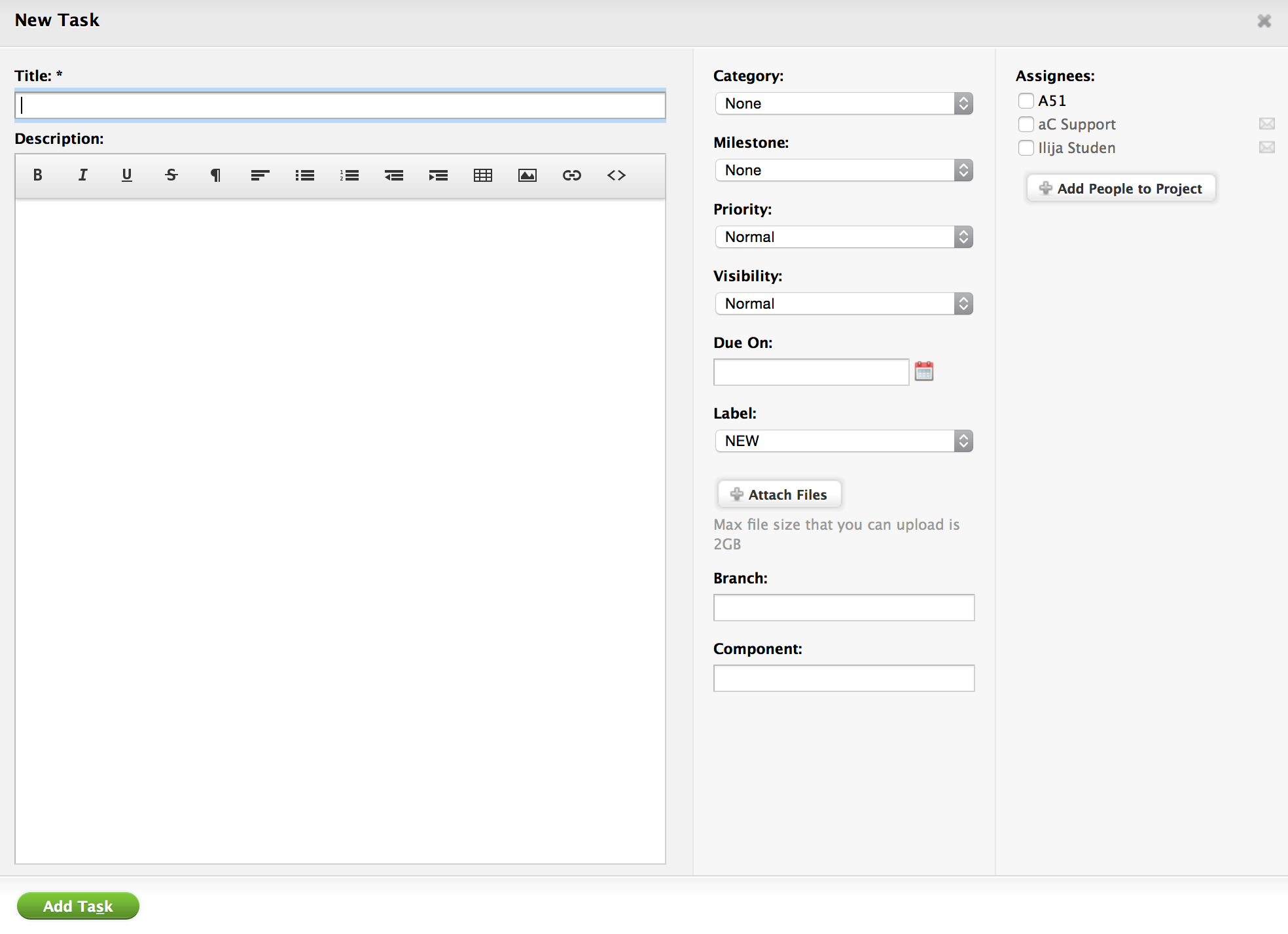
All of this can be achieved in ActiveCollab 4 with ease. Use labels for statuses, categories for areas and custom fields for components and branches. Here's how that form looks like:

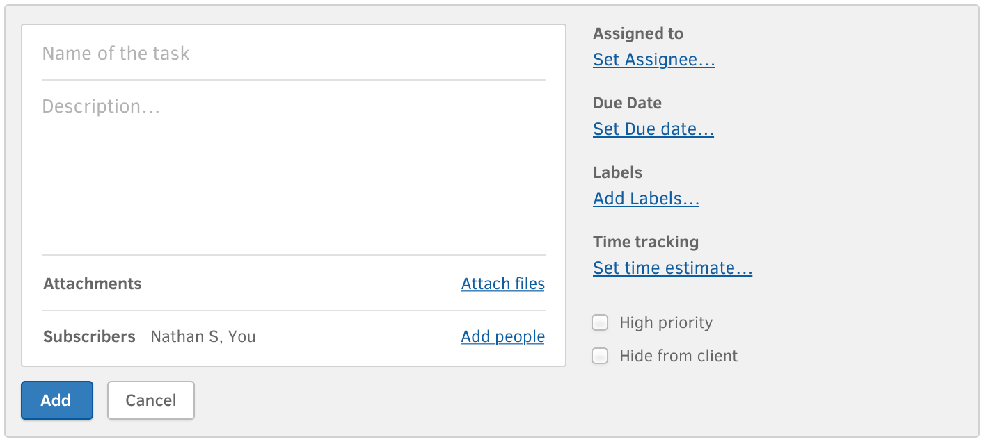
That's a lot of select boxes, where Category, Milestone, Label, Branch, and Component do the same thing: categorize the task by different dimensions. Instead, we wanted something simpler - an input form that can easily be embedded into the page that offers the same level of flexibility, but with less stuff going on. After several iterations, we ended up with this design:

Notice that it doesn't have a task list selector. Our design team worked on moving that step sooner in the task definition process before the form even opens. For this to work, we had to make the design of Tasks tab clean and airy. Previous iterations showed more information and offered more options, but they felt busy and were hard to skim. We shipped it to our team, used it for a couple of days and immediately noticed these problems.
If you decide to use task lists, there's a clean and seamless tasks page that makes quick categorization possible. When task list selector is hidden in a form, it's less likely that people will categorize their tasks. Instead of opening a form, and selecting a list, they first find a list and click on Add Task button underneath it to create a task. Double win - form is simpler, yet people end up with neatly organized assignments without worrying about categorization.
Labels
When we renamed milestones to task lists and introduced column view for tasks, pressure quickly fell of labels. We always thought of labels as ways to mark a task's status between open and completed, or resolution when it is completed. Now that lists can be used for that, labels could become anything that we wanted them to be.
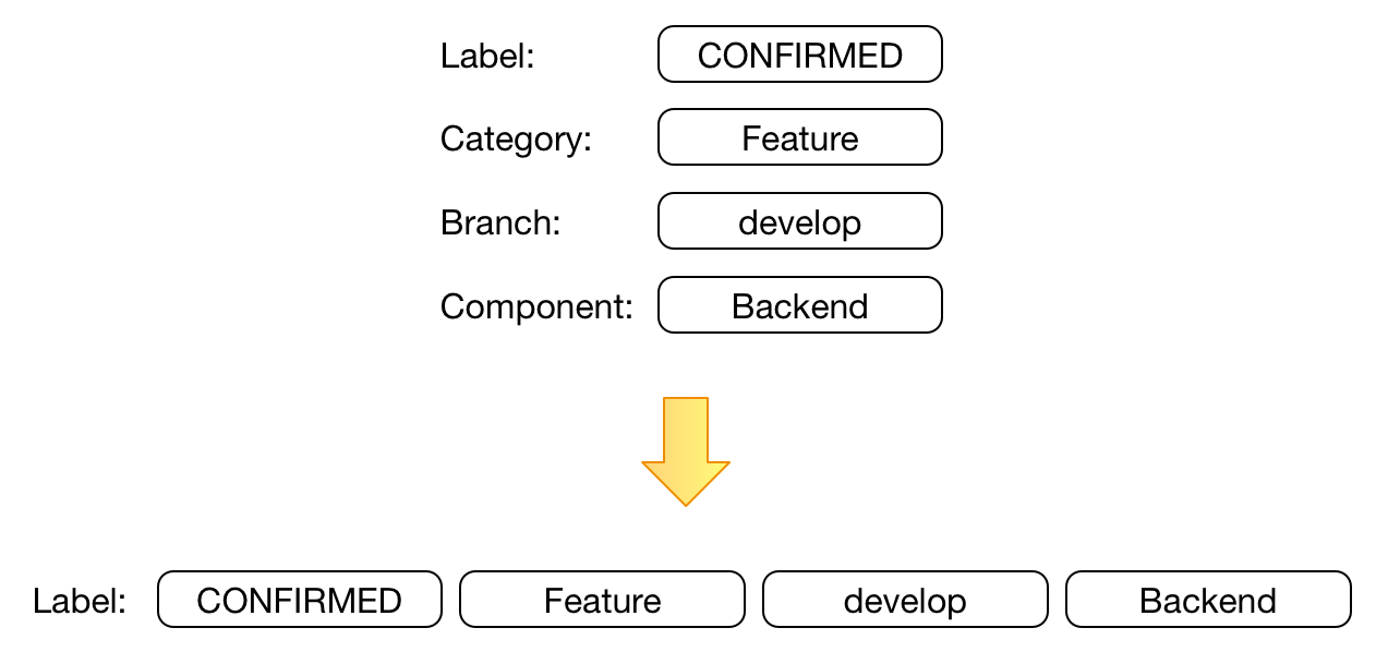
After several discussions, the team decided to go with something optional, simple and familiar: a task can have as many labels as needed, and you can color important ones. Users understand labels because they have been using them to bring order to chaos in Gmail for over a decade. Once we got started, labels quickly consumed categories and custom fields and became a scalable way of tracking all the extra task information:

What makes our implementation of label management a bit specific is that we gave emphasis to label swapping. Most implementations of tags and labels would force you to remove an old label and add a new one.
ActiveCollab doesn't - just click on a label to swap it with another one.
Changing CONFIRMED task to READY FOR QA is always a click away.
Thanks to this change, we ended up with a task form that does not ask for much, yet offers more flexibility than ever before. The beauty of this solution is that it is invisible to users who don't need anything more than a simple way to organize their tasks, yet scales to pretty complex workflows when needed. It's designed for novices, configurable for pros.
