Project Management
Where productivity meets collaboration!
Run all your projects, tasks, discussions, and client communications with ease. Get a clear overview of project budget and profitability, task lists, dependencies, and recurring tasks.
needed
View the way you need it - connect all the dots.
List View
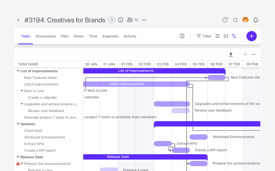
Timeline View
Board View
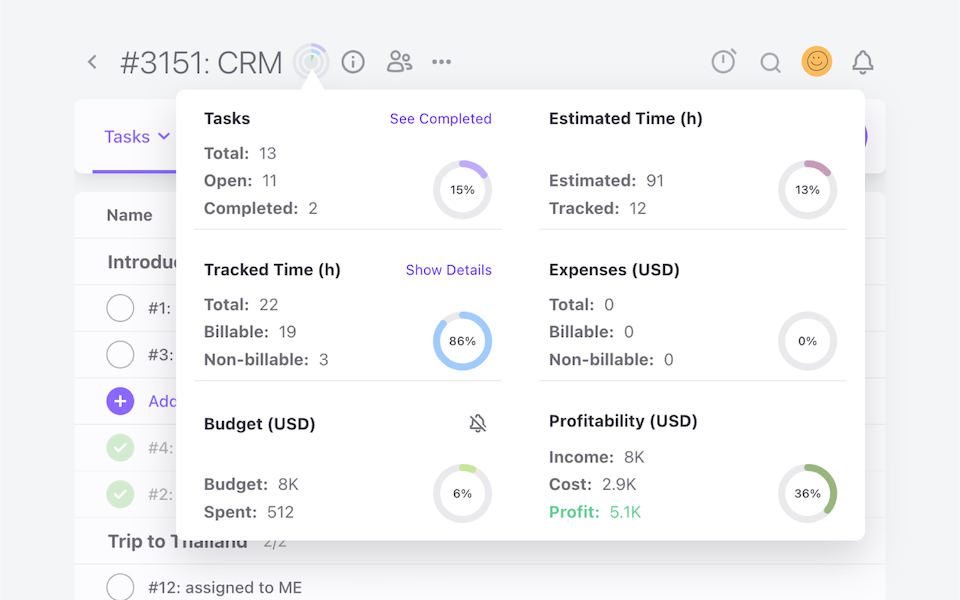
Project Profitability Overview
See how far you have gone and how much you still need to work with our real-time project tracking system.
Built-In Automation and Tagging
Repetition is sometimes a must, but you can rely on ActiveCollab to avoid clutter.
Dependencies
Create task dependencies. Change one date, and see dependencies automatically updated.
Recurring tasks
Stay on top of all your repetitive tasks at all times!
Project Templates
Save projects as templates for future use, more efficiency, and time.
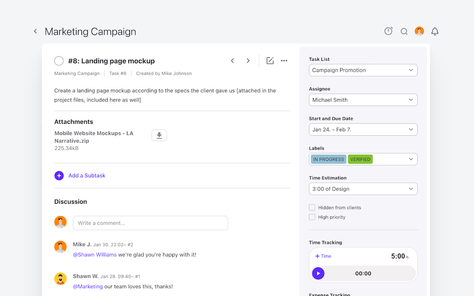
Custom Task Labels
Add custom labels to tasks for more information, better filtering, and custom reporting.
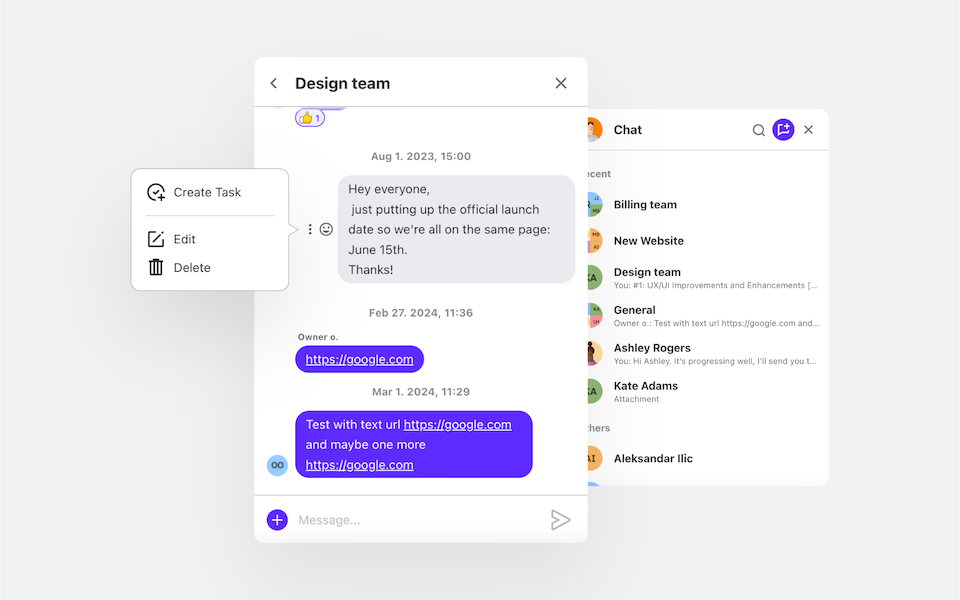
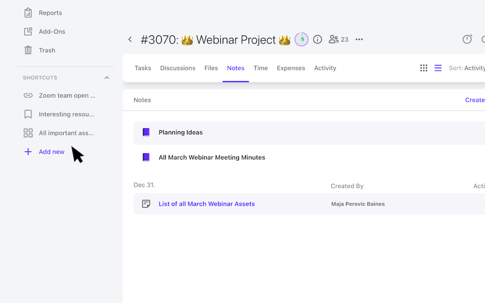
Team Collaboration and Communication
Encourage teamwork and transparency via different collaboration tools, integrated into one.
"ActiveCollab helped in making the transition smooth when we were pushed toward home working and was one of the key factors in maintaining the quality of our work."
Interior Designer, Havelkadesign
"ActiveCollab sounded too good to be true. We went into our trial period with low expectations – to our surprise and delight, we were proven wrong."
Founder and Creative Director, JUICE Creative Group
"ActiveCollab allows our teams to ask questions, track and update statuses, report time, and communicate effectively and efficiently."
Director, Strategic Accounts, Xivic
"We've gotten way more efficient with our time management and communication, and a big part of that is because of ActiveCollab."
Founder and Managing Director, Rock Agency


Great for Agile, Kanban, and Waterfall Project Management
No matter the methodologies you use, ActiveCollab Project Management supports them. Transfer all your work and continue where you left off.
Built-In Time Tracking Software - No Need for Other Tools
Have your team track and log billable and non-billable hours in a task against estimates or budgets.
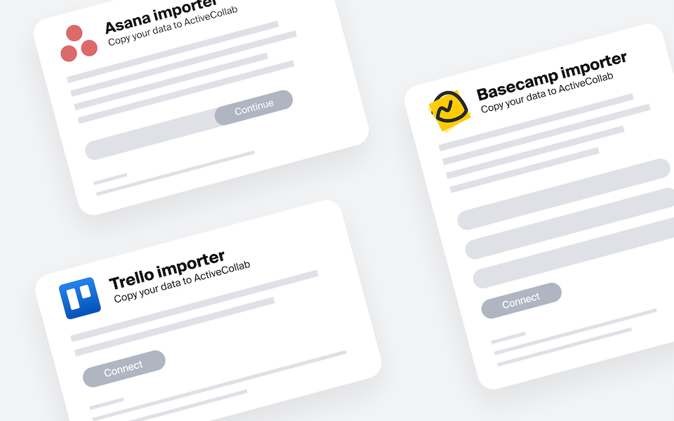
↳ See how Time Tracking Software worksImport Projects from Tools like Trello or Asana into ActiveCollab
Don't interrupt your work! Import your projects into ActiveCollab, and pick up where you left off.
Success and Support
50K Teams
93%
Happiness Score