The new ActiveCollab is very different from the previous one, and our website reflects that. This time we had an underlying philosophy and our lead UX designer tied all the pieces together.
Thanks to the Wayback Machine, we traveled back in time to see how our website evolved since 2006 when we published the first ActiveCollab.
July 2006 (open source)
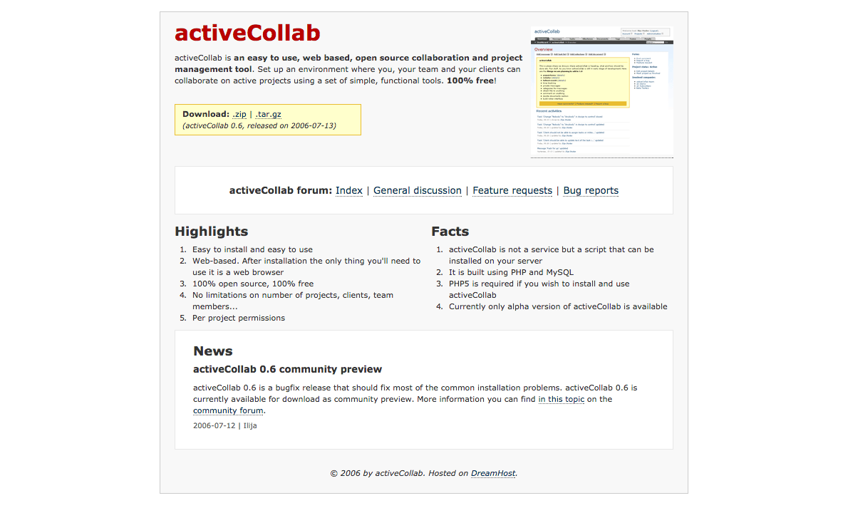
The first website was very basic. The style was non-existent and the main call to action was Download. No fancy graphics, no logo, no color scheme, or anything exciting — just a straightforward website that communicated: download, or help us develop it.
October 2007 (commercial v1.0)
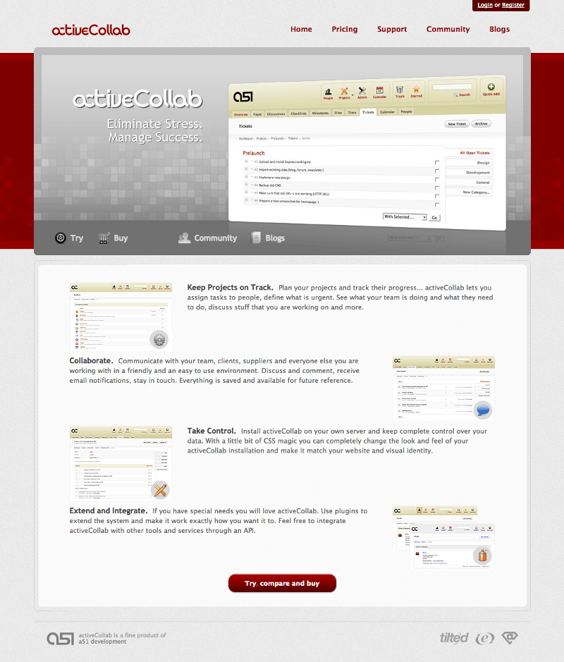
Compare this and the previous one — it’s an example of how website design follows the product’s transition from free to commercial.
The product screenshot is front and center, along with a few design effects, a list of features, and a big red button (and the awkward copy) telling you what to do. Notice it doesn’t say that ActiveCollab is a project management app — the customer has to deduce this by looking at the features.
The front page is clean and easy to navigate, but it comes at the cost of information such as pricing, testimonials, footer, contact, and a clear copy to communicate the nature of the software. Company colors and style are established.
May 2009 (v2.1)
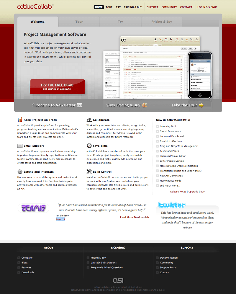
We started using Twitter to keep in touch with our supporters and we got testimonials from some neat companies. The front page got more cluttered as a result of the business.
The call to action is clear, but the front page tried to do a lot of things for different visitors. We tried to make it relevant to people who don’t know what ActiveCollab is, as well as for existing users who want to see what’s new. We were yet to learn the importance of negative space.
May 2012 (rebuilt v3.1)
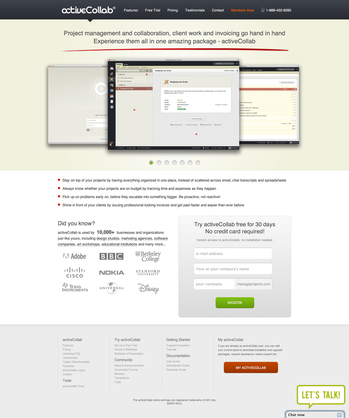
We rebuilt ActiveCollab from scratch for v3 and, of course, redesigned the website. We couldn’t decide on the “hero image”, so we put a lot of screenshots trying to convey all the features. Beneath, we put problems ActiveCollab solved so the visitor could see the benefits of using our software.
The biggest improvements were testimonials where we listed some of our biggest clients to establish credibility. We removed news and designed the landing page for the visitor who had no idea what ActiveCollab is. We also cut a step in our call to action and put a form right there on the front page, so the user could sign up without having to click a button first.
The design feels crowded. Testimonials fight for space and attention with the signup form. Also, the big red button in the footer feels uncouth and diverts the attention from the Try Now form.
July 2013 (v4.0 and cloud)
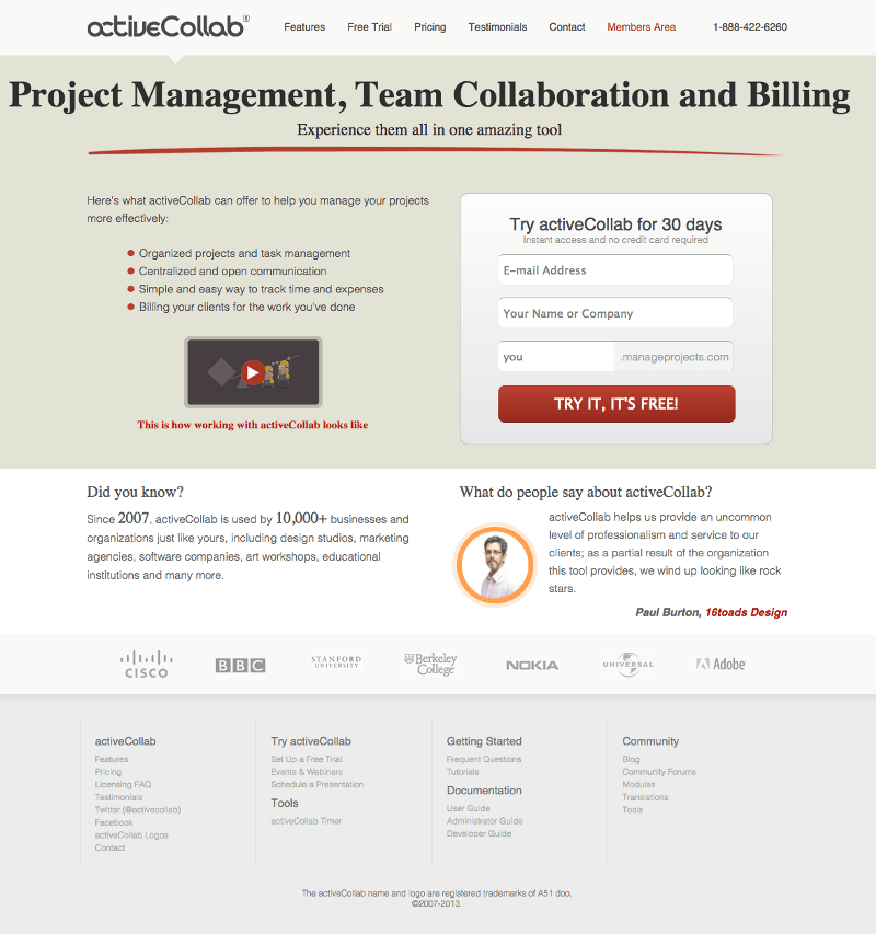
Much of the copy is gone, as well as product images. We put a video as a replacement (great idea). The signup form next to it joins the center stage to improve a sign-up rate. Testimonials are given more space and greater responsibility.
The problem with this design: it’s too sparse and doesn't evoke the senses. You’re asking someone to sign up solely on the fact that some big companies’ use it and a tiny video which doesn’t look very significant on the first scan. Also, the landing page pretends like the cloud option is nothing new (self-hosting was the only option before v4).
July 2014 (work on v5 started)
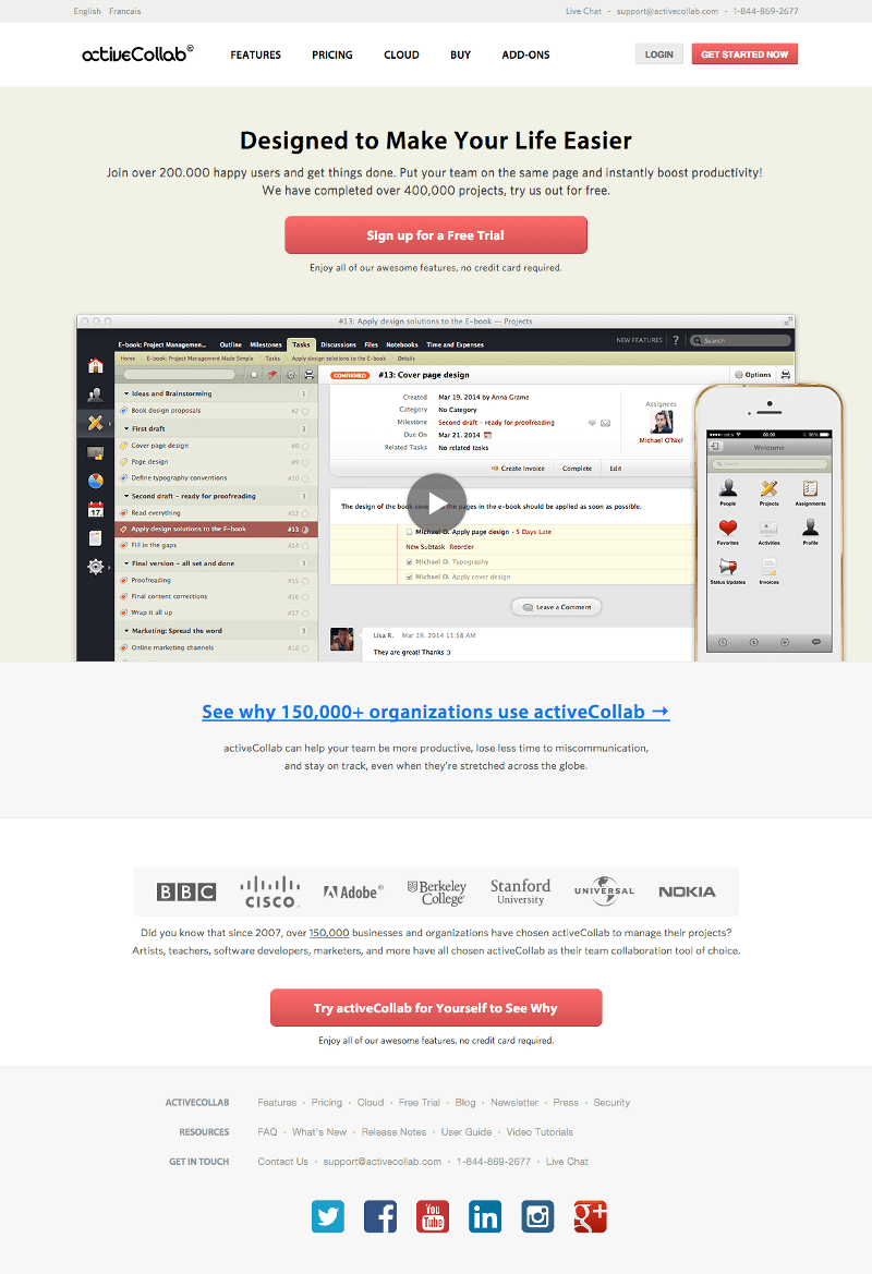
This was the pinnacle of the established design. The copy on the top established credibility (reinforced down the page) and a big video demonstrated the software in the best way possible. The sign-up button appears twice, just to make sure visitors don’t miss it.
The footer categorizes information better and social channels are visible. The website maintains tight control of all the information — nudging a new visitor to a certain action while telling returning customers where to find the information they need. One quip: our main market differentiator — self-hosting — is hidden.
May 2015 (new ActiveCollab v5)
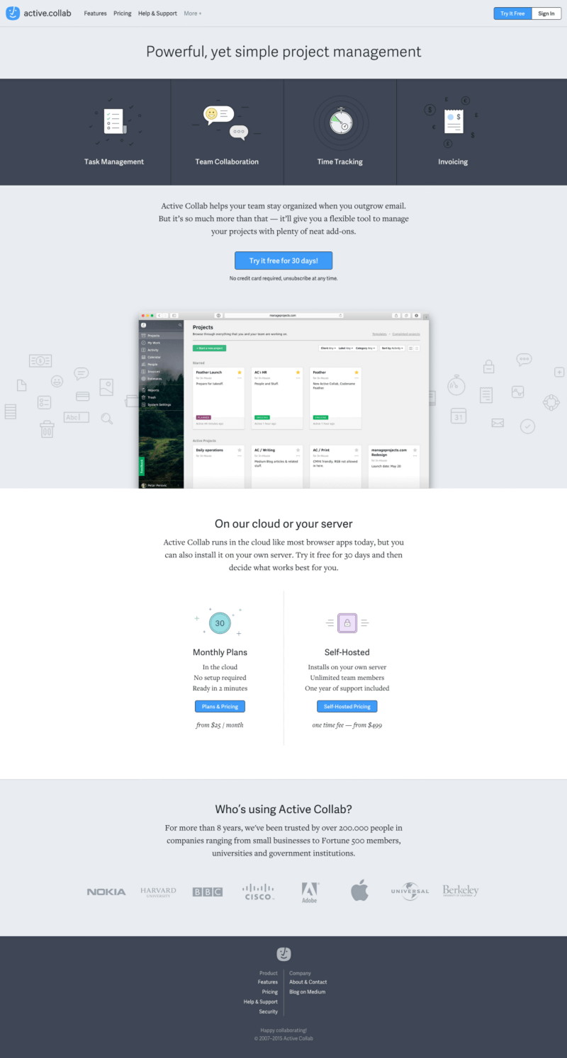
A 180-degree turn in visual identity. Copy and design are minimal, just enough to communicate each section’s purpose. Features are presented with drawings. There’s a clear call to action along with a single “hero image” and they comprise “above the fold” real estate. The header hides all the non-essential links under More. The most important distinction — cloud and self-hosting —are finally communicated from the get-go.
Elements are not competing for attention. Each has their space so the user can focus. The copy doesn’t try to sound smart but keeps it casual. The colors are harmonious and let the copy and images do the talking. Only the bouncy blue button tries to draw the attention.
What we did with the new ActiveCollab, we did with the website. We made it simple, sleek and friendly.
When a new visitor lands, we don’t bombard them with everything ActiveCollab can do. No, we try to keep the conversation light and breezy. All we want to say is:
ActiveCollab is cool and here’s a few things it can do. Get in touch, we’d love to hang out.